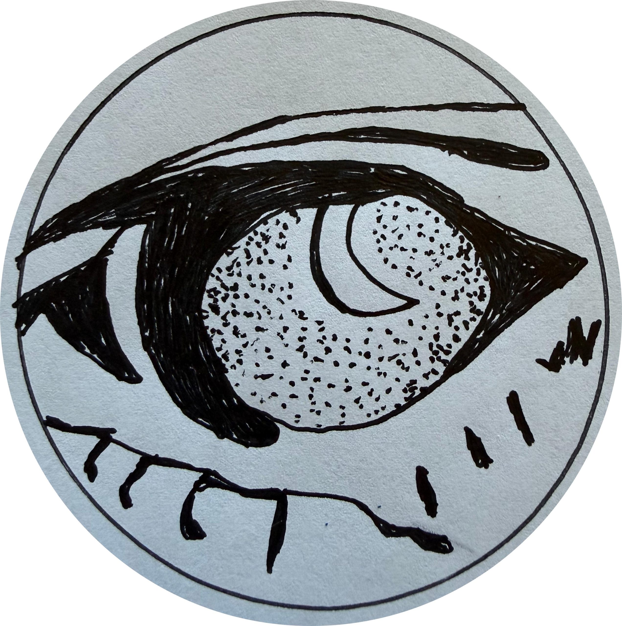
I had just landed on the concept of using “oneiroglossy” as the brand for this press. I needed a logo that spoke to the language of dreams. Things, creatures, that come up from the depths. Night-time, and the illusions and fears that can bring. The depths themselves, some great ocean.
Using those images and ideas, I drew this sketch. I used a photo of a crocodile as a reference for this sea creature that is rising from the deep. Is it a dragon? Ceto? Some other sort of leviathan?

Then, I knew I needed to simplify it a great deal. I made a few copies of the sketch and started, first, by inking it.
But it wasn’t simple enough. So I started tracing the inked versions and getting tighter and tighter.

I decided I needed to focus mostly on the creature’s eye, as that was the idea or being that had risen out of the sea. It was also the most compelling and interesting part of the sketches. Then, I decided, since I was cutting out the sickle of the waning moon, I’d make the eye use a moon shape as a pupil. That makes the creature even more magical, and dream-like.

I even tried focusing only on the iris.

But I think the loss of context makes it less interesting.
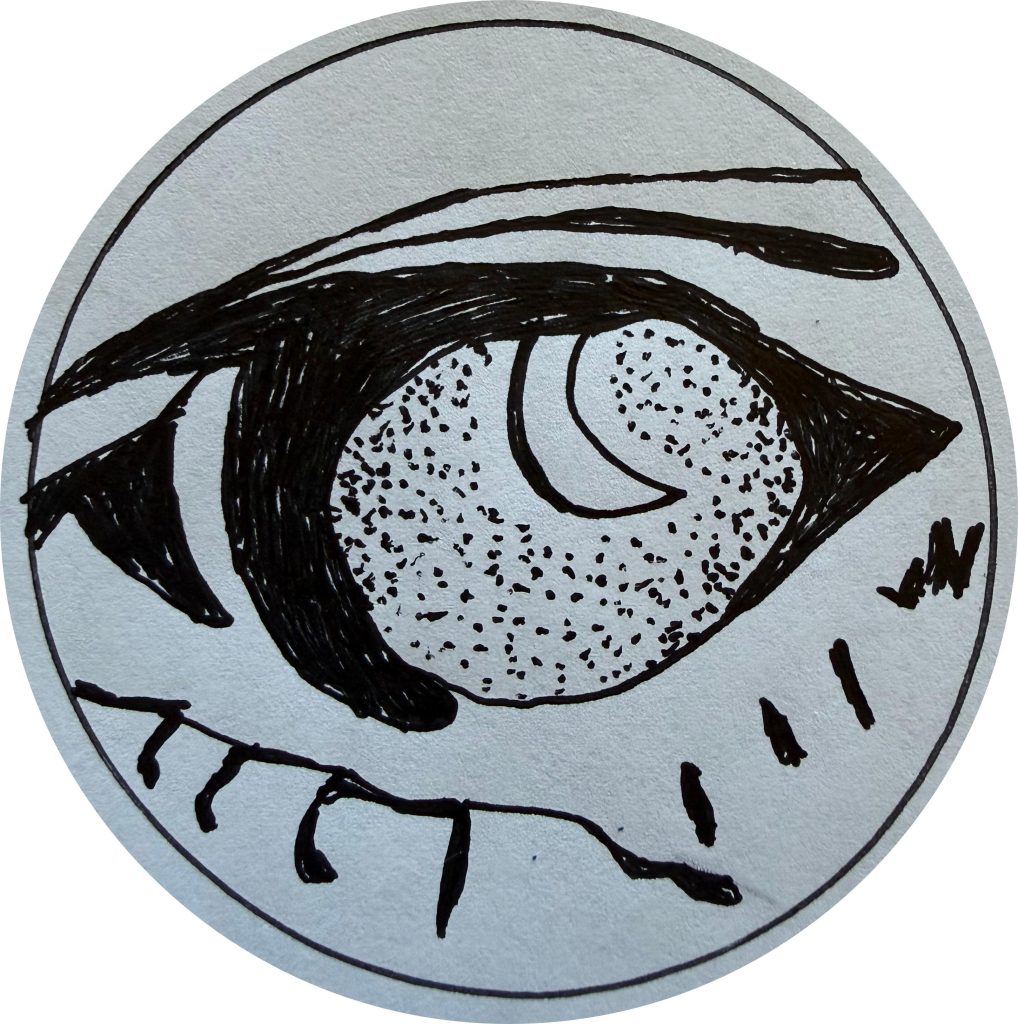
When I brought it into my computer to make things out of it, I considered removing the pencil lines, the little places where my ballpoint pen had gone outside the lines. But I’ve since decided to leave them there. This is hand-made, and I don’t mind if it’s not polished and perfect-looking.
Leave a Reply